Orange You Glad?

“Orange”, Created by author using Midjourney
Trying to add some zest to your space?
Feeling like you need a boost of Vitamin C this winter?
Look no further than color #2 on our ROYGBIV sequence of hues: orange.

How to Design with Orange
Orange may not be the first color that many of us think of when redesigning our homes. However, this tangy color offers a refreshing spritz when used correctly.
Did someone say Aperol? 🍹
Do you want a pop of color? Opt for a citrusy orange.
Do you want earth tones? Select a beautiful rust or marigold color.
Do you want to make your space feel light and bright? Lean towards a coral or apricot shade of orange.
This quote from writer Heather Bien in The Spruce showcases the diversity of the color orange.
“There’s an orange that can work in almost every home, especially when you bring in complementary colors that can either temper its brightness or add a lighter, airier feel. Try a deep, muted orange in a moody cottage or a crisp, clear orange paired with white and pink in a feminine, classic space. You can make orange work with nearly any decor style. ”

It’s important to note which colors are complementary, or split-complementary to orange.
Blue is the direct complement to the color orange. To the left and right of blue, blue-green and blue-purple can also be paired with orange.
Here are a few pieces of home decor that highlight orange with its complementary and split-complementary colors.
To note, another popular combination is pink and orange!


Orange as an Accent
Leave Halloween behind with this subtle and timeless coral vanity. Soft and calming, this shade matches the pale blue floral wallpaper perfectly.
Designed by Principal and Creative Director of Creative Tonic, Courtnay Tartt Elias, this bathroom offers a colorful flair.
Another fun way to add orange as an accent is by finding a funky light fixture! Don’t be afraid to buy a can of spray paint either.

Designed by Principal and Creative Director of Creative Tonic, Courtnay Tartt Elias
Orange as a Backup Dancer
Interior designer Summer Thornton is a mastermind when it comes to mixing pattern and color for bold interiors.
This living room from her Seriously Seductive Co-op Project is no exception!
She skillfully divided the space by carefully balancing the long room with two seating arrangements. By mixing various eclectic chairs together, the room feels energetic and inviting.

Notice how the marigold sofa adds that bit of warmth that the space would be lacking otherwise.
A solid back up dancer - she may not be the focal point, but the whole performance would be lost without her.

Summer successfully created a space that feels sophisticated AND inviting. Yes, you can sit on the furniture.
Pro tip: Instead of painting the ceiling a flat white, they applied a high-gloss lacquer, adding to the overall brightness of the room. When the interior looks this fabulous, it should most certainly be reflected on the ceiling!
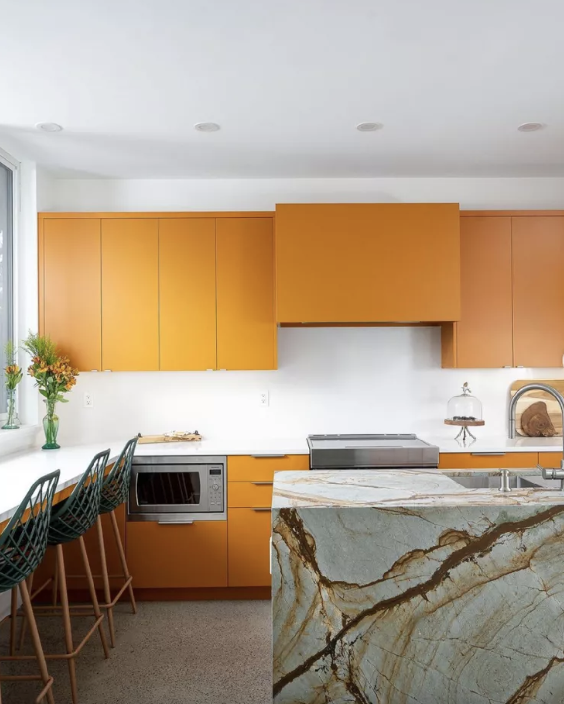
Orange Front and Center
Wouldn’t you just feel so happy to cook everyday? 😉
This kitchen from Carmelin Design Build features a triple waterfall island in Blue Roma Quartzite. While the stone feels a bit more serious, they paired it with tangerine colored cabinetry to lighten the mood.
Did you know that many countertops now come in a leathered finish?
A leathered finish is a deeply textured matte finish, which brings out the natural characteristics of the stone. It’s best used on darker stones! It’ll hide fingerprints and scratches better than polished.

The orange limewash walls of Justine Cushing’s New York apartment add a timeless texture and cheer.
It’s been said that she chose this custom color when she moved into her apartment in 1970, and never considered changing it!
Orange in Architecture
Afterglow, by Opsis
You can find this stunning feat of architecture and design inside the Student Experience Center (SEC) at Oregon State University. Fondly called Afterglow, this staircase is comprised of two primary parts.
A central ceiling piece showcasing an inverted ridge line surrounded by mirrored tiles.
A continuous surface that wraps the stair baluster and extends to the first and second level ceilings.

According to the Architizer article on Afterglow, “Afterglows are the optical phenomena associated with the scattering of light particles during sunset that produces a range of warm rosy hues in the sky. This effect gets amplified by the occurrence of volcanic ash in the atmosphere, which deepens the color range with reddish hues.”

Can you guess how many custom powder coated aluminum strips were used to create this staircase?
Just under 2,000!

“While the last major eruption of Mount Hood was over a century ago (1866), it has contributed to the atmospheric effects all across Oregon, and beyond, to this day.
“It can be experienced during twilight hour in certain climatic circumstances (clear to partially cloudy skies) and is one of the elements that makes Oregon’s atmosphere unique.” (Afterglow, Architizer 2024)

Amorphis and Mathew Au’s Afterglow installation enlivens the main atrium with artwork meant to delight and engage students.
Comprised of approximately 1,000 unique mirrored tiles, the “ceiling” of the staircase packs quite the punch!

Color Symbolism
Russian artist Wassily Kandinsky described orange as “red brought nearer to humanity by yellow.”
Positive: Harvest, warmth, affordability, happiness, spirituality, adaptability, sacred, courage, love
Negative: Mourning, loss


In many Eastern religions orange is considered a sacred color.
Hindu and Buddhist monks wear orange robes, and in Hinduism, orange represents fire and therefore purity; impurities are burned in fire.
Origin of Orange

Pigment Colour Index: Orange Pigments, Jackson’s Art
Similar to red, orange pigments were also used in prehistoric times. Humans used various minerals like ochre and iron oxide to create their orange hues. Orange can also be seen in the Lascaux Caves in South-Western France.
Sound familiar? Ochres were the first natural pigment I reviewed in my Living Colorfully in 2024 blog just a few weeks ago.
Do you ever wonder if the people at the time realized the significance these caves would have for us today? The odds are slim - but it’s cool to think about!


“Ancient civilizations, including the Egyptians and Mayans would extract yellow-orange shades from earth minerals like ochres, clay, and limonite, which were abundant and readily available in the earth’s crust.”
As with most things, humans desired a more diverse and more readily available orange pigment, thus beginning the quest for synthetic orange pigments.
The Creation of Orange Pigments

Orpiment Crystal
1. Orpiment: is a deep colored orange-yellow mineral that was ground down and used for painting and sealing wax.
“In fact, it was one of the few clear, bright pigments available to artists until the 19th century, whose dawn saw the introduction of cadmium yellows, chromium yellows and organic dye-based colours. After the 19th century, orpiment became redundant because of its extreme toxicity and incompatibility with other common pigments, such as verdigris and azurite.”
(A History of the Colour Orange)

Crocoite Mineral
2. Crocoite: In the late 1700s, French scientist Louis Vauquelin discovered the mineral crocoite, which led to the creation of chrome orange, the first synthetic orange pigment. Other synthetic pigments soon followed.
According to Maria Mellor, “These new pigments, plus the invention of the metal paint tube in 1841, meant artists could paint outdoors and capture the colors of natural light.” (A History of the Colour Orange)
Orange in Art
In 1872, Claude Monet painted Impression Sunrise in which a tiny orange sun is the focal point of the image—its reflection illuminating the water’s surface.

Orange became an important color for all impressionist painters. Having studied recent books on color theory, they knew orange placed next to blue made both colors appear much brighter. (A History of the Colour Orange)
Vincent Van Gogh was perhaps orange’s biggest fan.
According to A History of the Colour Orange, “Orange and yellow represented for Van Gogh the pure sunlight of Provence. He created his own oranges with mixtures of yellow, ochre and red. He put an orange moon and stars in a cobalt sky.”


Orange Accessories
Red is associated with energy and stimulation, and yellow is responsible for happiness and cheerfulness. It’s no wonder that orange makes us so happy!
Orange brings a high degree of positivism, always rejuvenating us in the most difficult moments.
“The great and invigorating benefits of the orange colour should be used every day, even if it is just a small object, like a mug or a pen, which we use in our daily tasks.”

Perhaps you’re trying to journal in 2024!
This is the perfect cheery notebook to grab when you want to log your thoughts.

Whether this is your style or not, I hope it brings a smile to your face!
Fun and playful, this candlestick is the perfect addition to your summer tablescape.

This rug comes in a variety of sizes, perfect for any space! It gets better… it’s washable!
Thank you, Ruggable.

Looking for just a pop of orange? This sconce is perfect for above a bathroom vanity.
How stunning would these sconces be in a library painted navy blue with these sconces on either side of a piece of artwork?
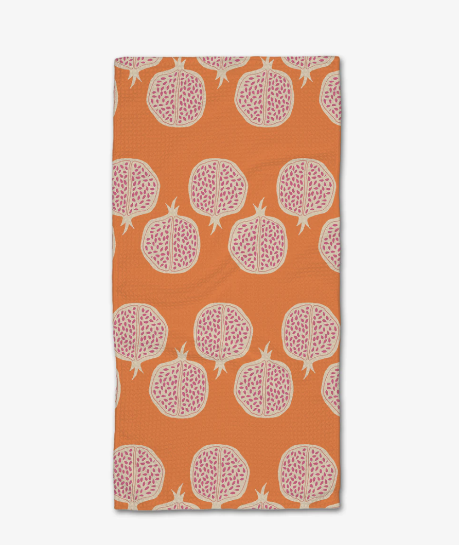
This quick drying tea towel is soon to be a household favorite.
Love the alternating pomegranate print set against the orange background!
Get Happy, Friends!
I’m channeling my inner citrus queen — where can you add orange to your interiors?
I would love to see how you use orange in your space! Tag me on Instagram @maison.de.molly 📍