RED (Designer’s Version)

“RED (Designer’s Version)”, Created by author using ChatGPT
Okay, I’m pretty proud of the cover art on this one. Whether you’re a Swiftie or not…
…Are you red-y for it?
The first stop on our “Living Colorfully” journey is the color red. The ringleader of ROYGBIV. 🌈
The popular color red spans many industries, from cosmetics to fashion, automobiles, and interior design. Just to name a few!
In my opinion, people either love or hate the color. It’s the perfect pop for some, and too saturated and strong for others. However, specific shades of red are going to be popular in 2024, as they’ve already been making a splash in 2023.
Remember, red isn’t just a bright cherry apple shade. It ranges from fire engine red to burgundy —and there’s a lot of shades in between!
Let’s dive in!

How to Design with Red
It’s not easy folks! Red can be a very difficult color to design with.
Do you want a pop of color? Opt for a punchy red.
Do you want earth tones? Select a beautiful terracotta or clay shade of red.
Do you want to make your space feel more sophisticated? Lean towards a rich burgundy.
This quote from Lilly Cao in an article by Arch Daily sums it up.
“Darker, maroon hues may read as sultry and enticing, while bright, neon reds are friendly and eye-catching. All-encompassing red, if done poorly, may feel overbearing, but if done effectively can create a unique ambient experience. ”

It’s important to note which colors are complementary, or split-complementary to red.
Green is red’s direct complementary color. When you look to each side of green, yellow-green and blue-green can also be paired with red.
Below you’ll find three red-green successful combinations, Christmas aside.


Red as an Accent
This kitchen, designed by interior designer Corey Damen Jenkins, boasts a beautiful red range with a matching custom hood. In an otherwise neutral space, this pop of color adds warmth and visual interest.
Corey’s Troy Residence showcases a consistent design thread and narrative using this warm red throughout.
Red as a Backup Dancer
This powder room designed by Collins Interiors highlights wallpaper adorned with red floral blooms and buds. Reading overall as a blue room, the red adds a level of depth and whimsy to the space.
*Pro tip: paper those outlet covers! Even if you’re DIY installing at home, it’ll create a high-end look. It’s worth the extra effort!


Red Front and Center
To all of you who fear commitment, this isn’t for you. 😉
Selecting the right shade of red can be a slam dunk. A prime example is this stunning burgundy butler’s pantry by Palmer Weiss.
By leaning into the warmer cranberry tones, this space feels moody and inviting.
Red in Architecture

Image taken by author during a tour of Kentuck Knob.
Frank Lloyd Wright
Being that this famous architect’s signature color was red, he often paired it with a natural stone or wood facade, allowing the red to pop and catch the viewer’s eye.
Later in his career, he started adding his signature on a red tile to the homes he designed. This tile can be found on the right side of the entrance to Kentuck Knob.
If you’d like to dive deeper into all of the homes Frank Lloyd Wright designed, check out The Frank Lloyd Wright Foundation’s article on “Frank Lloyd Wright’s Work”.
I’ve highlighted a of his few stunning properties below.


PPG Paints, local to Pittsburgh PA, launched the “Colors of Fallingwater” Palette inspired by the iconic home and its wooded surroundings.


PPG Paints, Fallingwater® Red (PPG13-02)
Fallingwater® Red is a dark, shaded, spiced red with a Sedona red-rock undertone. It is a perfect paint color for a showstopping grand entrance. Pair it with darker wood tones.
Here are three great examples of how you can use this historical color throughout your home.
Wallpaper (bold and dramatic!)
Floral Arrangement (temporary!)
Color Drenching (paint your ceiling too!)


Color Symbolism
Commonly associated with love, the color red has a wide range of cultural meanings.
Positive: Love, action, prosperity, good fortune, vitality, beauty, wealth, power
Negative: Danger, caution, evil

Outside of street signs and dating “red flags”, red is a positive color for Far Eastern and Indian cultures. So much so, that many couples traditionally incorporate the color on their big day.

Client of East Meets Dress, wearing the Maxine dress.
While struggling to find a dress for her own wedding, Jenn Qiao and her Maid-Of-Honor founded East Meets Dress.
The first modern fashion company to bring Asian-American representation and inclusion to the traditional wedding industry.
Many Asian and Asian-American brides choose to wear a red wedding dress to honor their heritage — a symbol of happiness. 👰🏻♀️
Origin of Red

Photo: Kenneth Dedeu via Shutterstock
Originally found in clay, red is one of the oldest pigments. Dating back to prehistory, it’s one of the first colors that was used by artists.
“The oldest evidence that archaeologists have discovered for the use of red is the use of ocher (clay infused with rust) in a cave in South Africa. They estimate that it was inhabited 170,000 years ago!”
Three Natural Red Pigments (there are more!)

"The Battle of San Romano", by Paolo Uccello *1439-1440)
1. Vermilion: is an ancient red-orange pigment, made by pulverizing the mineral Cinnabar. Since this pigment darkens with age, it often can develop a purple-red surface sheen.
In the painting to the right, you can see the aged and darkened vermilion along the horse’s bridle. It’s likely that the other shades of red in this painting were created using vermilion as well.
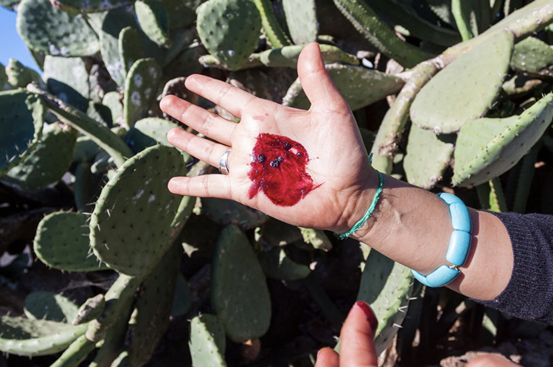
Cochineal bugs are covered in white wax while infesting cacti, but a hard pinch will reveal the carminic acid that’s abundant in their bodies.
2. Carmine: This vibrant red pigment is made from cochineal, a type of insect. Cochineal dyes were used in Central and South America for centuries before being brought to Europe in the 15th century.
According to The Color Red — History, Meaning and Facts, “Since the bugs are so small, nearly 70,000 of them are required to produce one pound of dye. This dye appears as carmine, natural Red 4 or cochineal extract in ingredient lists on food labels. It’s also common in cosmetics.”

Madder roots
3. Madder: A plant-based pigment, madder has been used for centuries to produce red and pink dyes. The roots of the madder plant contain alizarin, which provide the distinctive color.
Madder was grown as early as 1500 B.C. in Central Asia and Egypt. As stated in this Natural Pigments article, “Cloth dyed with madder root pigment was found in the tomb of the Pharaoh Tutankhamun (King Tut) and in the ruins of Pompeii and ancient Corinth.”.
Red Accessories

Slim Aarons “Hibiscus Flowers” Photograph, sold by Jonathan Adler - $1,495 🌺
If you’re not sold on the idea of painting your walls or buying wallpaper — check out these red accessories that can help bring your space to life.

This soft throw blanket is the perfect accessory to spice up your room.
Throw it across the end of your bed, layer it with pillows on your sofa, or simply fold it across your blanket ladder.

This multi-colored pillow is perfect for any space. Perfectly paired with a blue chenille throw, this pillow offers a subtle pop of color in an otherwise neutral space.

This small 13” tray is perfect for a small console or ottoman.
Add your favorite glassware and a bottle of your favorite spirit for the perfect hosting tray. 🍷
I’ve been eyeing up these hilarious needlepoint pillows for awhile. There’s just something about a vintage inspired pillow that I love, especially when combined with dry humor.


Rich in color with a subtle luster, this velvet drapery frames the window in warmth. The heavyweight panel darkens the room while offering a soft, smooth hand and vibrant color. CB2 exclusive.

The perfect little whimsical touch for your fireplace mantle.
Mushrooms are ALL the rage in home decor currently. They may be on their way out in 2024, but stores are still loaded with options! 🍄

The lovable Eames Elephant scaled down to adorn shelves, tables, and more!
Get Red-y, Friends!
Did this inspire you to step out of your comfort zone?
Personally, I love the cranberry and rusty red tones and look forward to using them — not just when I pull out my Fall or Christmas decorations!
I would love to see how you use red in your space! Tag me on Instagram @maison.de.molly 📍