Green with Envy
“Green”, Created by author using ChatGPT
You’ve already met Roy – that vibrant trio of Red, Orange, and Yellow. Now, let's introduce his mysterious middle name, 'G'.
'G' stands out with a suave and secretive aura, embodying the mystifying greens of nature. It's an element of darkness, moody and dynamic, yet simultaneously familiar and friendly.
Like the hidden depths of a forest, 'G' adds a touch of mystery to the colorful personality of ROYGBIV!
How to Design with Green
Green is a complex color that can easily enhance any room or space!
Do you want a pop of color? Opt for a lime green.
Do you want neutral? Select a beautiful sage green.
Do you want to make your space feel moody? Lean towards a deep evergreen shade.
It’s important to note which colors are complementary, or split-complementary to green.
Red is the direct complement to the color green. To the left and right of red, red-orange and red-purple can also be paired with green.
Here are three wallpapers showcasing the split-complementary combinations.
Green as an Accent
Designer Desiree Burns transformed an 18th-century home in Rhode Island into a vibrant getaway.
According to Desiree Burns Interiors, “The clients favored whimsical spaces with bold pops of color”.
Original hardwood floors and an open-concept plan are met with contemporary and colorful design choices like this bold green bookcase.
Incorporating various shades of green throughout the home provided the homeowners with an inviting space infused with youthful and fun design elements.
The Ripple Effect Project by Desiree Burns Interiors
Pro tip: By using an accent color throughout your home it helps your spaces feel connected and in harmony with one another.
Have a space that just feels disjointed from the rest of your rooms? Look for a color that you love in your other areas and bring it into that space.
Green as a Backup Dancer
Interior Designer, Laura Solensky, isn’t shy when it comes to using the color green in her interiors.
The splashes of green below add texture and depth to each of her spaces.
The green latticed mirror is the perfect calming sage color for this soft, classically patterned bedroom.
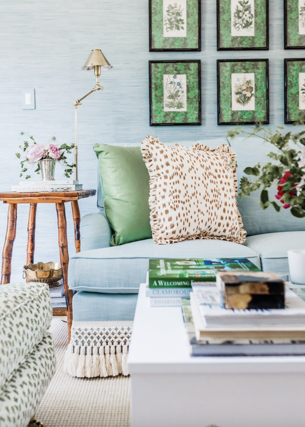
The green tortoise shell matting on the gallery wall was the unexpected pattern that this room needed. Set against the blue grasscloth wallpaper, the artwork takes center stage.
Incorporating the textural green tassel trim on the floral drapery adds a playful and whimsical touch.
Although the green in these spaces could be considered an accent, I define them as a backup dancer — because a backup dancer is essential to the bigger picture.
Both of these rooms could easily be written off as a soft blue, but the green adds a layer of interest.
Green Front and Center
This kitchen, designed by Molly Singer, is the type of kitchen that takes your breath away!
Bold design selections paired with classic architectural details make this kitchen truly one-of-a-kind.
Note the red lanterns, the direct complementary color to green. They help anchor the space while also adding a bit of playfulness.
Pro tip: Painting the trim, windows, and doors the same green as the cabinetry introduces a thread of consistency into the space.
Since this wallpaper has so much movement, it was essential to the design to simplify the other elements in the room by painting them the same color. If the window and door trim was white, it would add another visual distraction to the room.
Often, it’s important to limit your palette for the best results.
By painting all trim the matching green of the cabinetry, it allows other design elements in the space to catch your eye.
Green in Architecture
Green architecture is a philosophy that advocates for building with the environment in mind by using sustainable sources of energy, designing efficiently to reduce energy use, and updating existing buildings with new technology.
Green design isn’t just about which hue you’re leaning towards — it’s part of a much bigger picture.
“Aficionados of slow design and slow fashion use ethical and green materials to make objects - furniture, clothes, jewelry - that lift the spirit and last a lifetime rather than one catwalk season.”
The same rings true in architecture and interior design - think about what you’re buying and how you’ll use it.
Here are 5 ways you can be more mindful when designing, taken from Sustainable Style: 10 Ways to Reduce Consumption and Waste in Home Decorating.
1) Plan for Longevity: Invest in quality, timeless design elements that stand the test of time. Designs that remain stylish and functional over the years reduce the need for frequent updates and renovations, ultimately conserving resources.
2) Support Local and Artisanal Products: Choosing local and artisanal products supports local economies and reduces the carbon footprint associated with transportation.
3) Indoor Plants for Improved Air Quality: Select indoor plants known for their air-purifying properties, such as snake plants, peace lilies, or spider plants. These plants can help remove pollutants from the air.
4) Sustainable Furniture Choices (thrift!): Buying secondhand or vintage furniture reduces the demand for new furniture production. It's an eco-friendly way to find unique pieces that can enhance your design.
5) Prioritize Sustainable Materials: Reclaimed and recycled materials breathe new life into old resources, reducing the need for new raw materials. Wood is a staple in interior design, but its sourcing can have significant environmental consequences. Look for wood certified by organizations like the Forest Stewardship Council (FSC), which ensures responsible forest management practices. Bamboo, a rapidly renewable resource, is an excellent alternative for flooring, furniture, and cabinetry.
Green Roofs
One of my favorite elements of green architecture is green roofs. Even though this isn’t practical for everyone, it’s a great way to provide shade, remove heat from the air, and reduce temperatures of the roof surface and surrounding air.
Many high rises in other countries have adapted this concept trading in green roofs for vertical forests.
You’ll even find this in residential homes — like this quaint, country hobbit cottage. 😉


First pitched by architect Stefano Boeri, “vertical forests” attempt to solve two metropolitan problems with a single, efficient solution.
While metropolitan areas are well known for their lack of greenery and the environmental and psychological side effects that accompany it, vertical forests are unapologetically focused on bringing greenery back to the city. (Vertical Forests and Their Impact on the Environment)
If you can’t have a green roof, here’s a DIY guide on how to create moss wall art! 🌿
Color Symbolism
The color green today is commonly associated with nature, since many of our exterior surroundings include shades of green in the plants and vegetation.
Overall, green is a pretty positive color — evoking peace and restfulness.
Positive: Luck, fertility, hope, life, harvest, virtue, strength
Negative: Jealousy, greed
Fun Facts
Currently, it is believed that at least 295 colors of green exist (The Color Green History & Symbolism).
Green was George Washington’s favorite color (Fun Facts about the Color Green).
Green has long been a symbol of fertility and was once the preferred color choice for wedding gowns in the 1400’s (10 Great Facts About the Color Green).
Origin of Green
The color green has been with us since the beginning of time.
It’s life as we know it. Literally.
“In fact, the color green didn’t come so naturally to those who tried to manufacture it as a pigment for paintings or decorating objects. At first, the hue was notorious for being a hard color to come by, and its pigments have been some of the most poisonous in history.”
How could the creation of the color green, something so natural, be so dangerous?
The Creation of Green Pigments
1. Malachite: Ancient Egyptian artists would grind malachite, a copper mineral, to create a green pigment.
The malachite was used to paint green on the tomb walls. The Egyptians believed green was a symbol of rebirth.
The famous bust of Queen Nefertiti on display at the Neues Museum, Berlin (Image: Philip Pikart).
2. Verdigris: Verdigris is a copper acetate, which creates a slightly transparent bluish green pigment. The ancient Romans came up with the solution to soak copper plates in wine to create verdigris, a green pigment that comes after weathering the metal.
The reaction that follows produces a blue-green deposit, which can then be scraped off, ground, and used as a pigment.
According to Anna Pokorska, “Unfortunately, verdigris is very reactive and can become dark brown or even black with ageing. However, it was identified as the primary green pigment on the headband of Queen Nefertiti’s bust, where it retains its hue” (Colours of Ancient Egypt – Green).
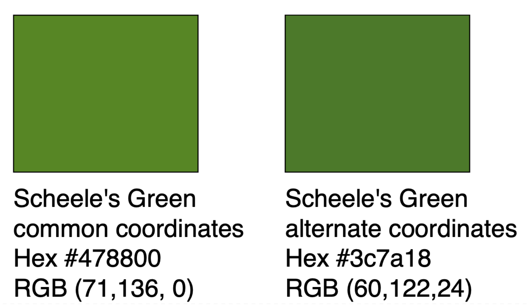
3. Scheele’s Green: In 1775, Swedish chemist Carl Wilhelm Scheele invented a deadly, bright green hue made with the toxic chemical, arsenate. It was so popular that by the end of the 19th century, it had replaced the earlier mineral and vegetable dyes—but its invention came with a price.
4. Paris Green: By the end of the 19th century, a similar pigment called Paris Green replaced Scheele’s Green. However, it was still highly toxic.
This was the pigment used by French Impressionists such as Claude Monet, Paul Cézanne, and Pierre-Auguste Renoir to create their lush green landscapes. Some believe the pigment may have been responsible for Cézanne’s diabetes and Monet’s blindness. Paris Green was eventually banned in the 1960s.
(The History of the Color Green: From a Poisonous Pigment to a Symbol of Environmentalism)Green Today
Despite modern advances in color technology, producing green dyes and pigments is still difficult and many hues continue to feature toxic substances.
One of the most common shades today is called Pigment Green 7. Used in plastics and paper, it contains chlorine, which, when consumed, is known to lead to illness and even death.
Another popular hue is Pigment Green 36, which also includes chlorine and potentially hazardous bromide atoms.
Lastly, the popular bright Pigment Green 50 is a toxic cocktail of cobalt, titanium, nickel, and zinc oxide.
(The History of the Color Green: From a Poisonous Pigment to a Symbol of Environmentalism)Is this where I say don’t try this at home?
Green in Art
As mentioned above, many green pigments were unstable and have lost their original vibrancy over time.
Angelo Bronzino, a late Italian renaissance painter, spent two years on his 1591 painting “Noli me tangere,” which depicts Christ as a gardener.
Commissioned by a man who wanted to hang it in his father’s funeral chapel, the oil-on-wood painting has faded from it’s original bright green to brown (Why Renaissance Paintings Aren’t as Green as They Used to Be).
When fresh, its (verdigris) shade of bluish green is rare and luminous. But like many pigments popular in the 15th through 17th centuries, verdigris is toxic and unstable.
“To anyone living in the 21st century, it might not be obvious that Renaissance paintings were once much more colorful than they look now. “If you look at the paintings of, say, Leonardo da Vinci, they are very, very dark,” says Didier Gourier, a chemist at the French National Centre for Scientific Research and an author of the study. “But they didn’t always look this way.” ”
Imagine dedicating years of your life perfecting a painting, choosing the perfect shade of green for that eternal masterpiece, only to find out later that the green has ghosted you, leaving behind nothing but a colorless memory.
It's like the art world's version of "Now you see me, now you don't!"
Remember how the invention of Scheele’s Green came with a price?
According to Emma Taggart, “Scheele’s Green was used on paper, wall hangings, fabric, and even children’s toys. Some 19th century journals contained reports of children becoming ill in bright green rooms, and ladies in green dresses becoming sick from consuming the toxic vapors. Historians believe the pigment caused the death of French emperor Napoleon Bonaparte in 1821, as his bedroom wallpaper featured the deadly hue” (The History of the Color Green: From a Poisonous Pigment to a Symbol of Environmentalism).
When Scheele’s Green wallpaper became damp or moldy the pigment in it metabolized, releasing poisonous arsenic-laden vapors.
In 2008, an Italian team tested strands of Napoleon’s hair from four points in his life—childhood, exile, his death, and the day thereafter. They determined that all the samples contained roughly 100 times the arsenic levels of contemporary people in a control group. (The Color That May Have Killed Napoleon: Scheele’s Green)
While Napoleon's cause of death was stomach cancer, it has been suggested that the wallpaper in his environment could have accelerated his condition.
Green Accessories
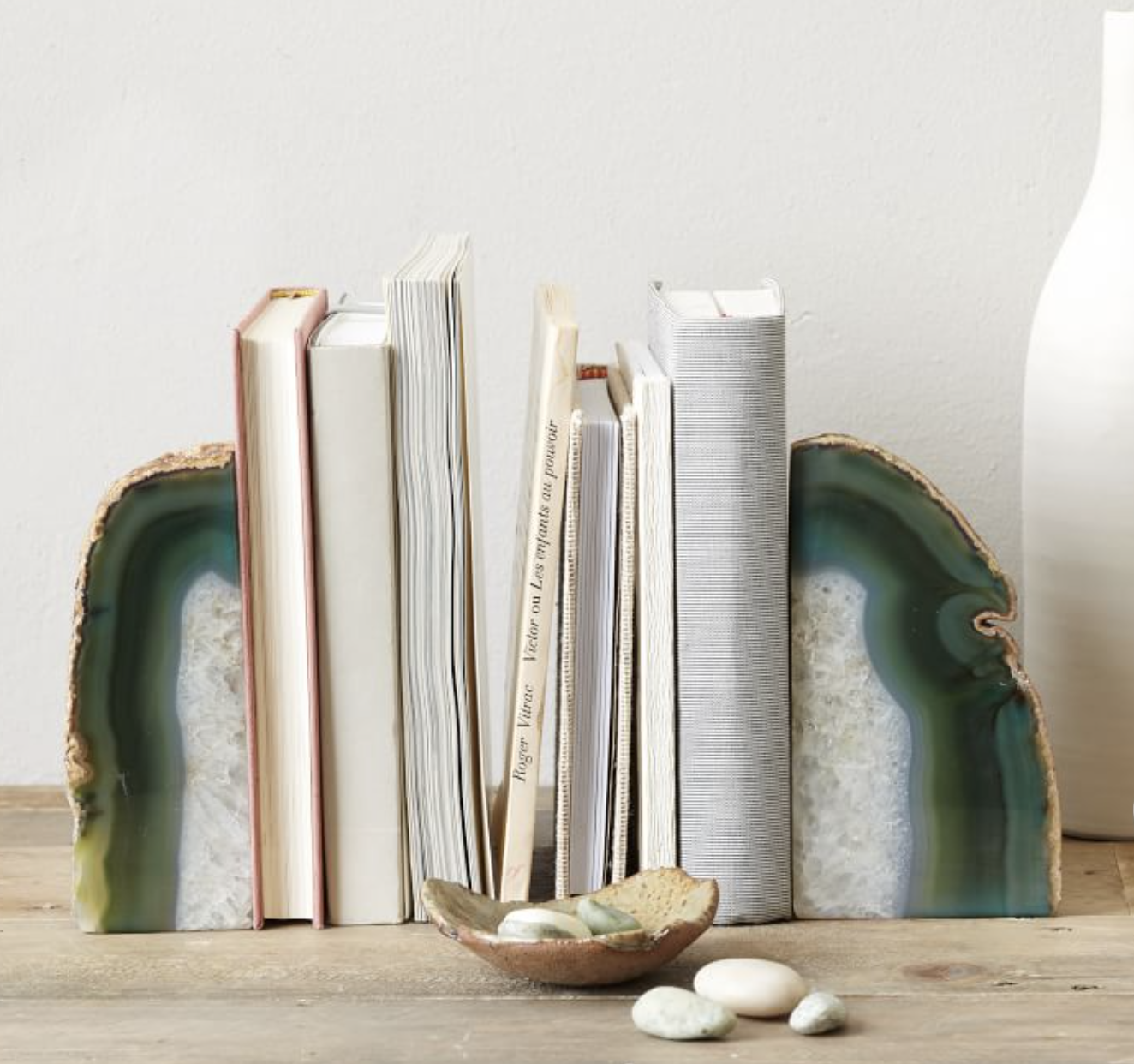
The perfect accessory for any bookshelf.
The perfect spring accessory. Emerald and lime green are the perfect duo!
Handwoven from bamboo, this brightly-hued basket is generously sized to store table linens, washcloths, or other trinkets.
The perfect pair for any coffee table, console table, or bookcase.
Get Green, Friends!
No need to turn Hulk-green with jealousy at fancy designer homes. You can sprinkle a bit of green magic around your humble abode without emptying your piggy bank.
A friendly reminder to reduce, reuse and recycle ♻️
I would love to see how you use green in your space! Tag me on Instagram @maison.de.molly 📍


