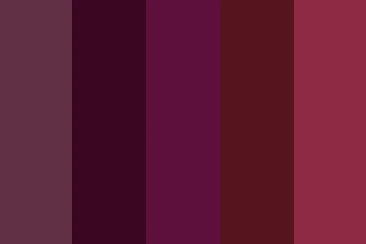
Lavender Haze

“Lavender Haze”, Created by author using ChatGPT
This popular color has hit the spring fashion trends for the past few years.
Caught in a lavender haze, are we? We can all thank Taylor Swift for her lyrical genius. Now, every time I see lavender, I half expect the Grammy-winning soundtrack to start playing.
As we reach the end of our ROYGBIV journey…
I just wanna stay in that lavender haze.

How to Design with Violet
In interior design, purple has a versatile palette that ranges from vibrant and youthful to refined and sophisticated, depending on the specific hue chosen. This color has gained widespread popularity in recent years, shedding its previous association as a solely feminine choice.
Traditionally, lighter shades such as soft lilac and heather have been perceived as more feminine, whereas deeper, richer tones like plum or aubergine are often viewed as more masculine.
This evolution in perception showcases purple's flexibility and broad appeal in contemporary design.
Do you want a pop of color? Opt for a vibrant purple.
Do you want a relaxing, soothing shade? Select a lilac.
Do you want to make your space feel cozy? Lean towards a warmer reddish tone of purple.

It's important to recognize the colors that complement or are split-complementary to violet (purple).
Yellow is the direct complement to purple. Adjacent to yellow, both yellow-orange and yellow-green serve as perfect pairings with purple.


Violet as an Accent
Interior designer, home DIYer, and blogger Brittany Palazzo of Addison’s Wonderland selected this medium shade of purple for her daughter’s bathroom vanity.
The bathroom features a color palette dominated by white, pink, and gray, creating a backdrop that highlights the purple vanity as its focal point.
Violet as a Backup Dancer

Image credit: K&H Design / photograph Simon Brown
While this particular room may seem more like “violet front and center” it really truly is the backup dancer, and here’s why.
Interior designer, Katie Glaister of K&H Design, was tasked with designing the home of an avid art collector. Knowing that the design was pivotal to enhancing the client’s artwork, she selected this warm Tyrian purple.
This shade helps energize the room without overpowering the oranges and yellows throughout. (Decorating with Purple)
“For his study the owner had requested purple and orange, so we thought let’s go bold! Wishing to avoid too much distraction through contrast we used Edward Bulmer’s Tyrian paint on the skirtings, walls, cornice, window frames and the fireplace; this has made a daring color choice very easy on the eye”

Violet Front and Center
Designer Michelle Gage isn’t known to hold back when it comes to color — which resulted in this stunning lilac kitchen.
Combined with classic checkerboard floors, a farmhouse sink, and vintage-inspired pendants, this purple is the unexpected twist we didn’t know we needed.

In this setting, this shade of purple is viewed as classic and timeless.

Pro tip: If you’re already spending an arm and a leg on nice appliances, make them shine!
Don’t be afraid of color!
This beautifully warm shade of purple sets this range apart, and in the best way possible!
Additionally, the brass accents on the handles and knobs make this piece feel custom and perfectly designed for this space.
Violet in Architecture
Purple is a color used so infrequently in architecture that I wasn’t sure what I was going to find. But, alas, it exists!

© MANUELLE GAUTRAND ARCHITECTURE
A two-part project, the Comédie de Béthune, known as the National Drama Center in Béthune, France, was designed by the architect Manuelle Gautrand.
According to Ross Brady, in 1999, the architecture firm completed the original restoration of this theater with a curved mass covered in purple concrete varnish. (The Psychology of Color: 7 Opulent Instances of Purple Architecture).
“As an allusion to the regality often associated with live theater, the color choice works well, and was further modified in 2014 when the architect was called upon to add an extension to the building. This extension, clad in ornamental black panels, slightly appropriates the neighboring purple structure with a pattern of black, diamond-shaped stripes, capitalizing on the appearance of the original color with a subtle counterpoint” (The Psychology of Color: 7 Opulent Instances of Purple Architecture).
You’ll see four other architectural projects below from Brady’s article that utilize the color purple.


Noted by Brady in his article, The Psychology of Color: 7 Opulent Instances of Purple Architecture:
“The projects below all showcase the color in some form or another, either subtly or front and center. Equally noteworthy regardless of application, the desired intent between uses is quite similar: purple is employed to communicate opulence or exclusivity, and in many cases to stir a desire for such things”.
Color Symbolism
Positive: Royalty, spirituality, wealth, privilege, comfort, nobility, virtue
Negative: Sorrow

Fun Facts
Porphyrophobia is fear of the color purple
Purple Day (created to raise awareness for epilepsy) is celebrated on March 26.
***Purple is the color for epilepsy awareness because of its association with lavender, which is a traditional herbal treatment for the disease (20 Facts About The Color Purple).
Purple is the hardest color for the eye to distinguish.
You may have heard the “fact” that nothing rhymes with the word purple, this is incorrect. Curple is a strap under the girth of a horse’s saddle, which stops the saddle from kicking forward. Hirple is to walk with a limp, and Nurple is the act of roughly twisting a nipple! Who knew… (20 Facts About The Color Purple).
Origin of Violet

Pigment Colour Index: Violet Pigments, Jackson’s Art
The color purple may win the ROYGBIV award of being the most difficult to harvest…
“By some accounts as many as 250,000 snails to produce one single tablespoon of dye!”
Wait, snails? 🐌
In the historical city of Tyre, which is part of present-day Lebanon, an innovative method for producing purple dye was invented. This method, named Tyrian purple after the city, required harvesting and opening the shells of numerous Bolinus brandaris snails. The mucus from the snails was then left out in the sunlight and would turn a vibrant, reddish purple color that adhered to fabric incredibly well (History of Color: Purple).
Due to the labor-intensive method of production, Tyrian purple became an expensive dye. Consequently, it became a symbol of the nobility and royalty, as only those of considerable wealth and status could afford it (History of Color: Purple).
This explains why purple is frequently associated with royalty; historically, it emerged as the color of the elite due to its rarity and cost.
The demand for this color was great, and eventually with the invention of a synthetic purple it was able to be produced at a larger and more affordable scale.
The Creation of Violet Pigments

Brazilian trigonal hematite crystal
1. Manganese and Hematite Powder: Purple first appeared in prehistoric art during the Neolithic era. One example of this is the Pech Merle cave in France, dating from between 25,000-16,000 BCE. (History of Color: Purple).
Early humans would use sticks of manganese and hematite powder to draw and paint animals and the outlines of their own hands on the walls of their caves (Purple).
Tyrian Purple was not an exact color, but varied significantly from a warm reddish base through to cool bluish one.
2. Tyrian Purple: This ancient and prestigious dye was made from the secretions of sea snails. It was notoriously expensive to produce and often reserved for royalty.
As stated by Tyrian Purple, The Color of Royalty, “All these snails had to be collected by hand, crushed, salted over three days and then boiled for ten more. Only then would they release the rich purple colour. To ensure the dye didn’t wash out of the fabric, a mordant (a liquid that combines with the dye to render it holdfast) was needed. The most popular of these was urine.”
Yeahhh… I’m sure that smelled wonderful.
3. Purple Gromwell: In ancient China, purple was obtained not through the sea snails, but purple gromwell. The dye obtained did not easily adhere to fabrics, making purple fabrics expensive.
Before the introduction of synthetic dyes to Japan, the roots were commonly used as a dyestuff for luxury textiles, typically high-end kimono and obi. The process of extracting purple dyestuff from the roots was an exceedingly long, complex and time-consuming process, also adding to the expense of the final product (Lithospermum Erythrorhizon).

Purple Gromwell Leaves

4. Han Purple: Han purple in its pure form is actually a dark blue, that is close to indigo.
Remember our dear friend indigo from last week’s blog?
According to Wikipedia, “The purple color seen in samples of Han purple is created by the presence of red copper (I) oxide (Cu2O) which is formed when Han purple decomposes (the red and blue making purple)” (Han purple and Han blue).
5. Mauveine: One of the first synthetic dyes, Mauveine was discovered accidentally when chemistry student William Henry Perkin was attempting to synthesize the chemical quinine for the treatment of malaria (Mauveine).
Eventually, the name was simplified to mauve, and it rapidly gained popularity, particularly after Queen Victoria was seen wearing a dress dyed in this color. With the advent of the Industrial Age, purple dye could be manufactured inexpensively and in large quantities, making it accessible to the general public for the first time (History of Color: Purple).

Piece of silk dyed by Sir William Henry Perkin in 1860.
Violet in Art
Gustav Klimt, an Austrian symbolist painter, notably incorporated the color purple into his works, symbolizing luxury, mysticism, and depth.
While famous for his use of gold leaf, Klimt's strategic use of purple enhanced the emotional and thematic richness of his paintings.
This choice aligns with Art Nouveau themes, adding a distinctive, dream-like quality to his depictions of women and landscapes.


Violet Accessories

Whether as a place setting, a gift or a decorative item, the charming crystal lucky butterfly emanates a sweet touch of happiness and hope.
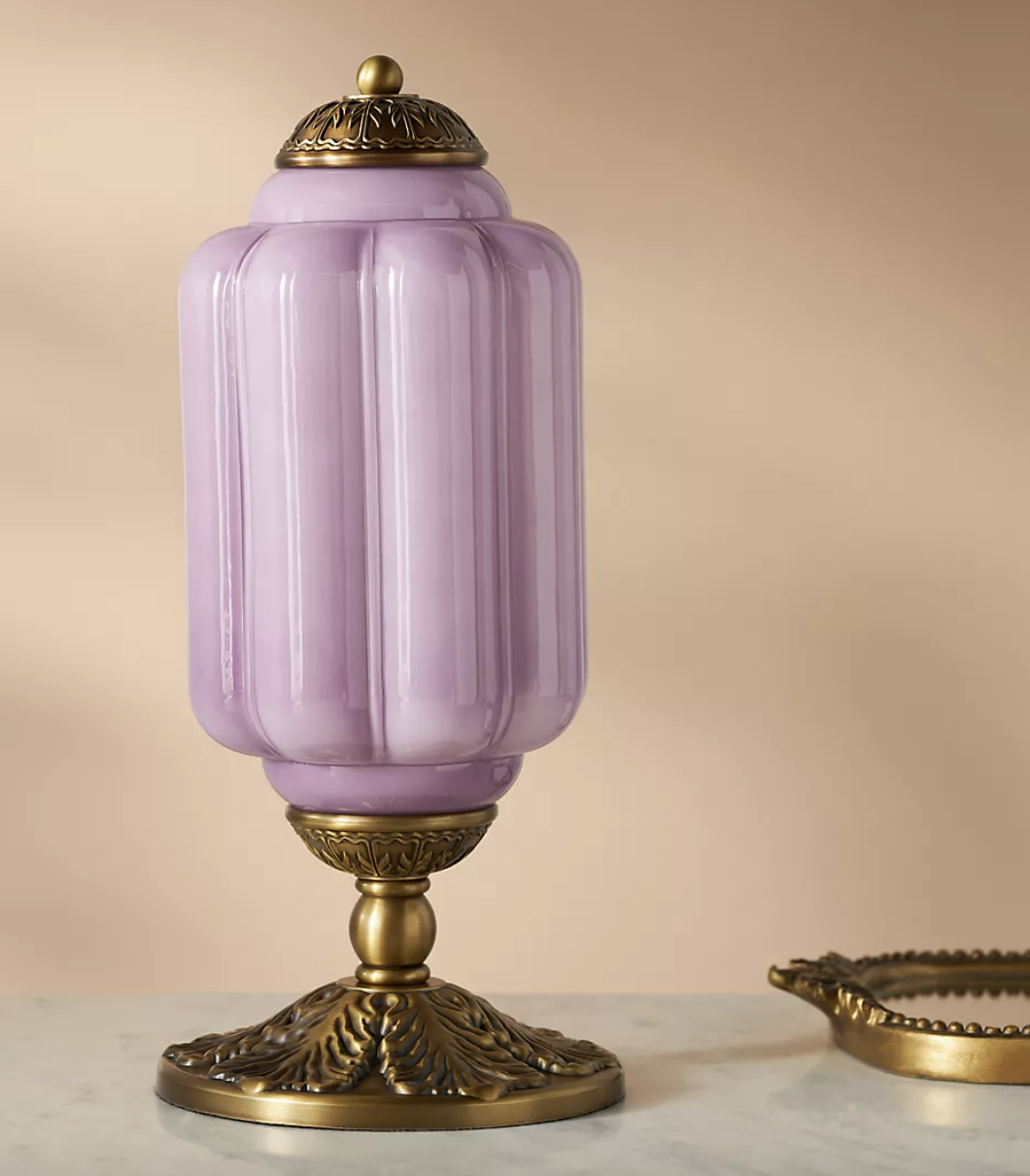
With a milk glass shade and an oiled brass base, this vintage-inspired lamp brings feminine charm to any space.

The most adorable mini bud vase that could dress up any nightstand or end table.
Love this glaze!

The fringe around the bottom of this swivel chair is what we all need in life.
Just don’t ask about the price…

A beautiful shade of lavender, this is the perfect recipe book for all of your favorites!
Get Violet, Friends!
I would love to see how you use purple in your space! Tag me on Instagram @maison.de.molly 📍